
My Friend Saw How Closely the App Matched the Design and Was Stunned
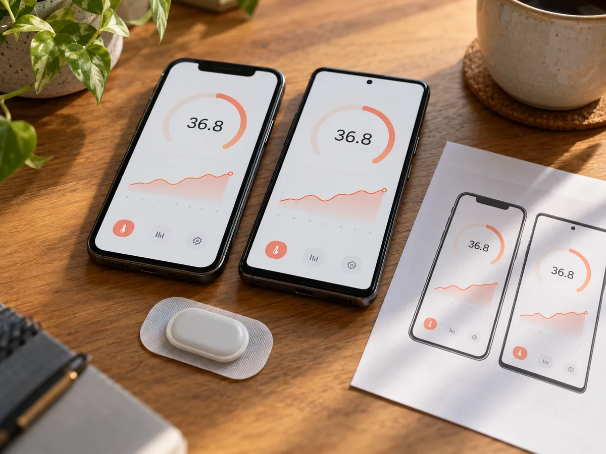
Two apps, two developers
When my friend's company gets client orders, it passes them to independent developers or studios. Recently he took on two apps at once: a temperature patch app for a medical device, and a study-abroad app. The requirements were about equally complex, and he gave them to two different developers. I built the temperature patch app.
The temperature patch app: design to screen
The temperature patch app has to show data from the hardware on screen in real time. There are many pages, and a lot of them can't just be static images. As the temperature changes, the colors have to shift in precise gradients, and the size, position, and rotation of the numbers have to be calculated from the values on the fly. At that point it's no longer visual design. It's algorithms.
Here's how I worked: first I drew every page, including every state. As I drew, I worked out how things move and how they're calculated: when a number fades in, when it slides out, when it scales. All of that has to be expressed in math. Once the drawings were done, I wrote the motion and logic in, one piece at a time.
After finishing the native iOS version, I didn't write the Android version again by hand. The key was architecture. I put real effort into it: the file structure, module breakdown, and logic flow match one to one across both platforms, and so do the code directories, naming conventions, and data flow. The benefit: the code can be translated.
Working from the iOS code, I had AI translate it to Android following that architecture, from Swift to Kotlin, with the logic kept the same. Because the architecture matched, the translation went through cleanly.
The result was two native codebases, both running well. Every calculation and every animation on iOS behaves the same on Android. Code with architecture, AI can translate. Code without it, AI can only guess at.
When it was done, my friend came over to look. He held the design files up against the pages I'd built, screen by screen. Whatever color was in the design was the color on the screen. Wherever a number sat in the design, that's where it sat on the screen. However a number changed and moved in the design, that's how it changed and moved on the screen.
His exact words: "This fidelity... it's amazing. I can't even tell which is the design and which is the finished app."
The finished product matched the design at 98%. The remaining 2% was pixel error in the design files themselves.
The other app
The study-abroad app, delivered at the same time, had problems.
That developer had sworn he could do it. In the end, he generated it with AI and said he'd built it himself.
What came out looked like a beginner's work: pixels askew, buttons out of place, messy text spacing, list items of different heights. Worse, the whole interface felt cheap. All the refined details in the design were gone.
Looking at that app, my friend said: "This looks way too cheap."
Two projects delivered at the same time: one built to the design, one cheap-looking on every screen. Put side by side, the client got it right away.
Why it turned out this way
That developer is a senior Java back-end engineer. His approach was: feed in the design, let AI generate it, hand it to the client, done.
But app development takes professional judgment. Why is this button this size? Why is the text spacing set this way? Why do the colors transition like that? These aren't coding questions. They're professional knowledge. App pixels, layout, screen adaptation, and feel weren't his area.
AI can generate code, but whether what AI hands back is right, how to fix it, and how to test it takes professional skill.
So the button positions were wrong, the input field spacing was wrong, the list heights were wrong. Spot a problem, fix one thing, look again, and do that dozens of times. He gave up and handed over AI's first draft.
I use AI differently. I know apps. When AI hands something over, I check it against the design right away and fix whatever doesn't match. That step relies on my professional judgment. I'm the quality inspector. He handed over whatever AI gave him. That's the difference.
When things went wrong, he thought of me
Later, my friend asked me: could I fix the study-abroad app?
In other words, he wanted me to take that app from cheap-looking to what the design showed.
I asked him: why me?
He said: "I saw how closely you matched the design on the temperature patch app. I figured if anyone could give this cheap-looking app some quality, it'd be you."
The extra money the client spent
Looking at that app, the client had no choice but to redo it. That decision alone meant the earlier money was wasted.
Not fixing it would cost more. A product that looks cheap tells users at a glance that it isn't reliable, and both the brand and the user experience take the hit.
So the client agreed to add budget and redo it. That extra repair budget is what my friend used to bring me in.
My rates aren't high. But the client was willing to pay this, not because I'm cheap, but because my friend had already seen on the temperature patch project that I can match a design at 98%. That reliability is what the client needed.
Rather than waste money again and have another developer botch it a second time, they preferred to pay me to get it right. The real cost of the cheap option is the repair cost plus the time cost plus the damage to the brand. Added up, it's actually more expensive.
What came next was a systematic rebuild. Working from the design, one component at a time: buttons, input fields, cards, list items, each one checked for position, spacing, size, color, and shadow. This wasn't "fix one spot." It was "rewrite the whole thing."
Wrong positions, fixed across the board. Wrong spacing, all adjusted. Missing shadows, added one by one. Missing line spacing, all filled in. In the end, it matched the design at 98%.
Linework Studio. Yubei, Chongqing.